

About the brand
Quaverly is a startup that aims to connect all the key players in the music industry through a networking app. The company has yet to launch as they’re in the process of raising money from investors.
The brief: Create a unique brand identity from scratch and position Quaverly as innovative, modern and community-oriented.


About the designs
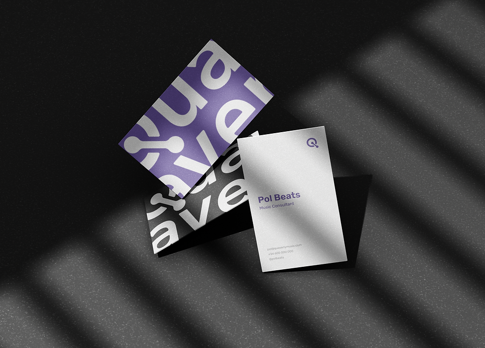
The name “Quaverly” was born from the brand’s musical core. A quaver (*note lasting half a beat) symbolizes connection: two are needed to make a full beat, just like two people to make a network. The suffix “-ly” adds rhythm and friendliness, echoing the brand’s personality.
The primary logo and logomark embrace simplicity with a custom “Q” at the center. Its circular form references the music community, while the stem includes two dots, representing individuals connecting through the app. It’s a subtle, yet meaningful nod to Quaverly’s mission of bringing people together.
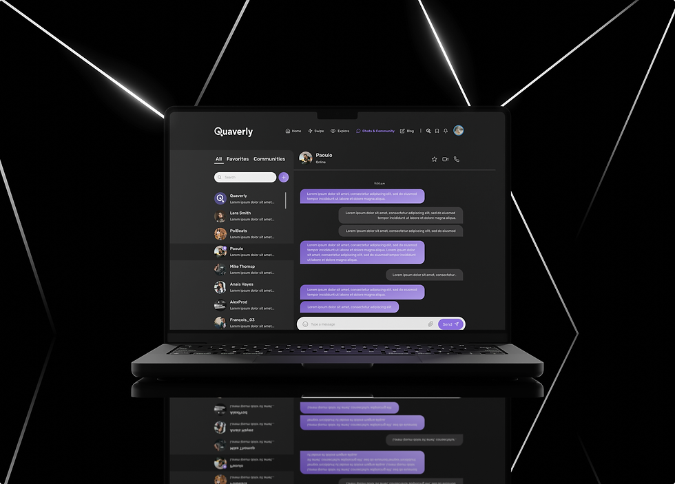
After multiple user interviews, the app and website were crafted to make networking feel effortless and enjoyable as part of the musicians daily routine. The interface is intuitive, visually engaging, and built to convert first-time users into loyal, paying customers. The dark-toned color palette was intentionally chosen to match user preferences for dark mode and aesthetic appeal, enhancing both usability and brand alignment.

Kind words.
We love the final result of the brand and app. From the name to the design, everything was simple and carefully designed. As entrepreneurs we loved having the opportunity to collaborate with Laia during the process, and all that we learned about branding and marketing. Thank you so much!!!
- Albert, Co-Founder


Results
01.
Consistent brand experience across marketing and product touchpoints.
02.
Reduced friction in the user journey, leading to improved engagement and repeat business.
03.
Clearer communication of product value and features.
